pomona lake
The client’s love for mid-century modern design is infused throughout the home. We took cues from the era, utilizing the balance of warm and cool tones, the incorporation of clean architectural lines, and the injection of lively patterns to make this home a welcoming blend of contemporary aesthetics and mid-mod vibes. If you look closely, you’ll even spot pieces from the client’s beloved vintage pottery collection in every space!
tABLE OF CONTENTS

the kitchen
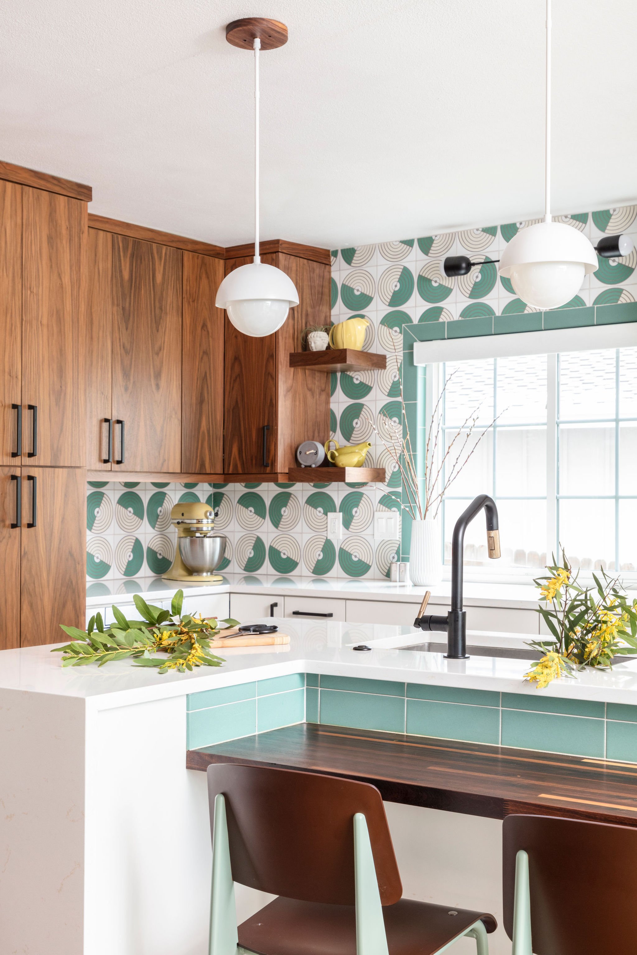
In designing the new layout for the kitchen, we decided to remove the pantry closet and expand into the former eat-in area. This gave us the opportunity to create a beautifully functional island with plenty of seating and prep space for multiple cooks in the kitchen. We were all still in love with the walnut flooring we installed during the first phase of this project and opted to lean into the classic tones and bring them into the cabinetry scheme. To balance all those gorgeous warm grains, we cooled the space down with a spunky hand painted tile that enlivens the space.
the family room
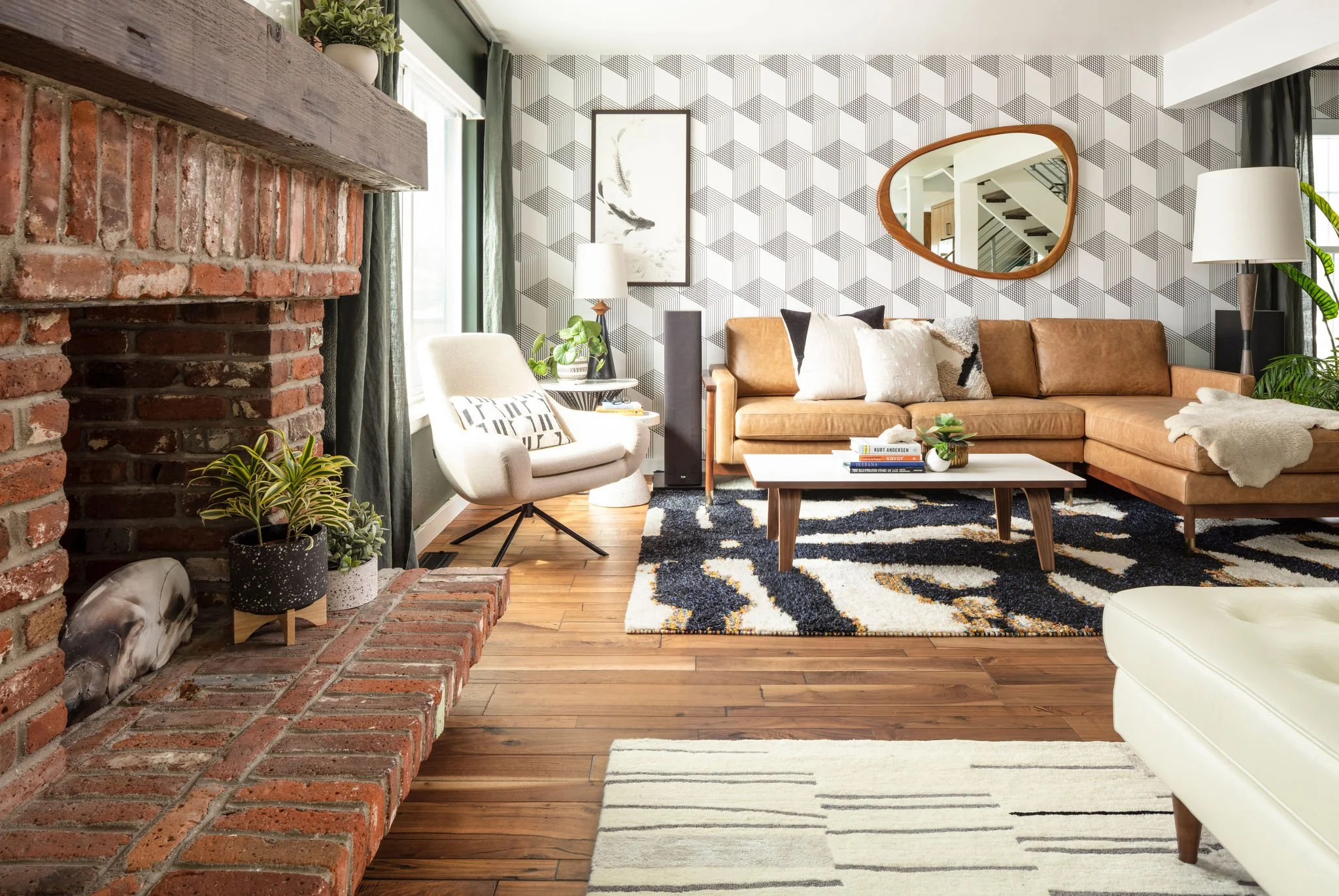
This long space needed flexibility above all else. As frequent hosts to their extended family, we made sure there was plenty of seating to go around, but also met their day-to-day needs with intimate groupings. Much like the kitchen, the family room strikes a balance between the warm brick tones of the fireplace and the handsome green wall finish. Not wanting to miss an opportunity for spunk, we introduced an intricate geometric pattern onto the accent wall giving us a perfect backdrop for the clean lines of the mid-century inspired furniture pieces.
the second level hall bathroom
Wanting the home’s guest bathroom to feel inviting and whimsical, we dove it to create a unique balance of saturated colors and lively patterns. Playing with geometric and organic patterns- from the simple tile grid to the nature inspired wallpaper, and slapdash terrazzo flooring- this space strikes a bold kinship of forms.
the lower level hall bathroom
All this little gem needed was a facelift. We utilized a dynamic black and white tile on the floor to jazz it up and continued the incorporation of warm woods and pops of color that we brought into the rest of the home.
the primary bedroom
These clients operate on different morning routines, so it was important that one of them was able to enter the bathroom and have access to their closet without making multiple trips back into the bedroom while getting ready. The new design allows them to enter the bathroom, close the door, and not reenter the bedroom until they’re ready to go for the day.
The clients were also in desperate need of additional closet space. With an excess of space in the existing bedroom area of their suite, we were able to redistribute their square footage and give them two sizable closets
THE primary bathroom
We had the pleasure of transforming our clients' primary bathroom into a functional and stylish retreat. The original shared shower and toilet room were reimagined into separate spaces, enhancing both privacy and convenience. To maximize storage, we added large drawer bases and pullout cabinets on either side of the sinks. The shower was expanded to include a comfy bench and a discreet recessed niche, with future-proofing for a steam shower. Aesthetically, the space now features handmade serpentine-patterned tiles with playful dot accents on the vanity backsplash and shower wall. We carried this dot motif through the flooring, cabinetry hardware, and light fixtures. For an extra touch of fun, we added metallic tiger wallpaper in the commode room, perfectly tying in with the vanity's accent tile.


