Hues That Heal: Transform Your Winter Mood with Color
Berkeley Lake Bedroom, Lindy Design Build
As winter settles in, we find ourselves spending more time indoors, longing for warmth, energy, and comfort. The right colors can completely transform how a space feels, influencing our mood, energy, and sense of well-being. With a thoughtful use of color, your home can become a sanctuary—energizing, calming, and uplifting when the darker days of winter seem to stretch on forever.
Let’s explore how different colors can help combat seasonal lows, inspired by spaces that evoke everything from serene calm to joyful vitality. These hues aren’t just about aesthetics—they connect deeply to our emotions and psychology, creating spaces that truly nurture.
The Energizing Glow of Yellow
In a bright dining nook, yellow walls shine like a burst of morning sunlight. Yellow is the color of optimism and cheer, a mood booster on the grayest of days. It stimulates energy and creativity, making it ideal for spaces where people gather to connect or start their day. Imagine enjoying your morning coffee here, feeling the warmth of the sun—even on snowy days.
If you're looking to inject happiness into your space, consider a bold yellow accent wall or sunny decor touches, like pillows or artwork. It’s the perfect antidote to winter blues.
Not sure where to start? We love the following yellows for this year’s go-to-glow-up:
Bold Sherwin Williams Yellow
Sherwin Williams Auric SW 6692
This a bold yellow that lies somewhere between a deep marigold and a spicy tumeric and casts a deliciously warm glow.
Sherwin Williams Optimistic Yellow SW 6900
This is a soft, creamy yellow that is cheerful and brings a delicate touch of warmth to any space.
Sherwin Williams Soft Yellow
Benjamin Moore Golden Bounty 294
A highly energized, vibrant yellow that adds golden depth and cozy warmth to any space.
Benjamin Moore Cotton Tail 0C-123
We love this softer alternate from Benjamin Moore. This airy yellow is cheery and subtle for a soft elegance that inspires.
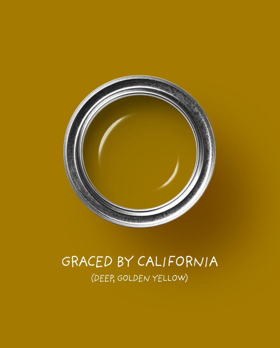
Tonester Paints
A deep, golden yellow offering a warm and vibrant ambiance
This is the softest of the soft yellow-ish white. Perfect for the minimalists out there who just want a touch of glow.
Goodness do we love Backdrop colors! This is no exception for a bright, cheery yellow that adds warmth and comfort.
This muted, soft yellow is a delicate addition to any space needing a touch of cheer.
Serenity in Teal and Sage
Soft blues and greens, like the teal bedroom or the sage green kitchen, bring a soothing, natural calm to any room. These colors are reminiscent of water and foliage, connecting us to nature's restorative powers even when we’re stuck inside.
Teal’s depth feels grounding and meditative, making it ideal for bedrooms or spaces where you want to unwind. Sage green, meanwhile, is understated and refreshing—a perfect balance for functional spaces like kitchens, where calm and clarity help us feel at ease.
In the teal-accented spaces shown here, the warm wood furniture and soft textiles enhance the cocooning effect. It’s a reminder that color paired with natural textures can create harmony.
Not sure where to start in these color families? Not to worry, we have our favorite paint colors to share for the 2024 season:
If you’re looking for a teal pop, we love these happy hues:
Sherwin Williams Cloudburst SW 6487
This happy blue-green is a well-balanced teal with a strong blue presence, offering a serene and versatile look.
Benjamin Moore Aegean Teal 2136-40
This is a super handsome, rich teal color that is inviting and quiet.
Benjamin Moore
Aegean Teal, 2136-40
Woof, we love this color. A black-teal paint that exudes elegance and refinement.
Backdrop Paint
Saturday on Sunday
A dark greenish-blue shade that creates a wildly comforting environment.
Bold Depths with Burgundy and Navy
Deep, moody hues like burgundy and navy blue envelop a space in richness and warmth. A burgundy wall paired with forest green accents creates a cozy, intimate environment—perfect for rooms where you want to curl up with a book or share a glass of wine by candlelight. The deep red tones bring passion and grounding energy, making the space feel alive yet snug.
Navy, on the other hand, is deeply calming and reflective. A navy living room wall provides a serene backdrop for bold, vibrant artwork, creating a space where energy and introspection coexist beautifully. The result? A room that invites you to recharge without feeling overwhelmed.
Deep jewel tones like burgundy and navy are making a bold comeback in 2025, reflecting a shift toward richer, moodier interiors. These saturated hues offer a sense of luxury and coziness, creating spaces that feel both dramatic and inviting. Whether as accent walls or through plush furnishings, these timeless shades are redefining modern design with their ability to evoke depth, warmth, and individuality.
Below are a few of our favorite colors in these categories:
Can’t fail Navy Blue:
Sherwin Williams Naval SW 6244
A classic navy that exudes sophistication and depth, perfect for creating a serene and elegant atmosphere.
Drop-dead gorgeous Burgundy:
Benjamin Moore Dark Burgundy 2075-10
A deep, moody hue that sets the scene for a dramatic and luxurious space.
Super Moody Pink-Black:
A rich, blackened purple that adds a touch of opulence and mystery to any room.
Dusty Deep Blue:
Backdrop Paint, School Blazer Blue
A deep navy blue with a subtle dusty hue that adds softness.
Turquoise: A Creative Energy Booster
In a vibrant study space, turquoise takes center stage, infusing the room with positivity and creative energy. Perfect for home offices or craft rooms, turquoise inspires fresh ideas and forward momentum. Against natural wood tones and clean white accents, this shade feels playful yet sophisticated.
If you’re feeling stuck or uninspired during winter, turquoise might be the burst of clarity your workspace needs.
Need some help picking the best pick-me-up in this family? Here are our choices for this season’s turquoise family:
Sherwin Williams, Nifty Turquoise SW 6941
A lively and refreshing turquoise that adds a cheerful touch to any room.
Sherwin Williams
Nifty Turquoise, SW 6941
Benjamin Moore, Mexicali Turquoise 662
A bright and playful turquoise inspired by the shimmer of beach glass.
Benjamin Moore
Mexicali Turquoise 662
A gorgeous turquoise green with depth and spirit.
Backdrop Paint, Barbie Dreamhouse Blue
A super-bold, Barbie inspired, blue turquoise paint for a pop. It’s so extra and that’s ok!
Backdrop Paint
Barbie Dreamhouse Blue
Soft Blues for Restorative Calm
In a pale blue living room flooded with natural light, everything feels expansive and peaceful. Light blue hues evoke open skies and fresh air, bringing a restorative sense of clarity and calm. Paired with neutral tones like soft beige or warm wood, pale blue creates an inviting space to relax and breathe deeply.
This is a perfect color for communal spaces where you want to encourage openness and connection—like a family room or reading nook.
It feels like the options for soft, pale blues and greens are virtually limitless. Nonetheless, we’ve collected a few of our favorites for you:
This is an expert pick for a reason: such a delicate, lacy blue that is calming and serene for any type of space.
Benjamin Moore, Palladian Blue HC-144
All is calm with this soft, airy blue-green that conjures clear skies.
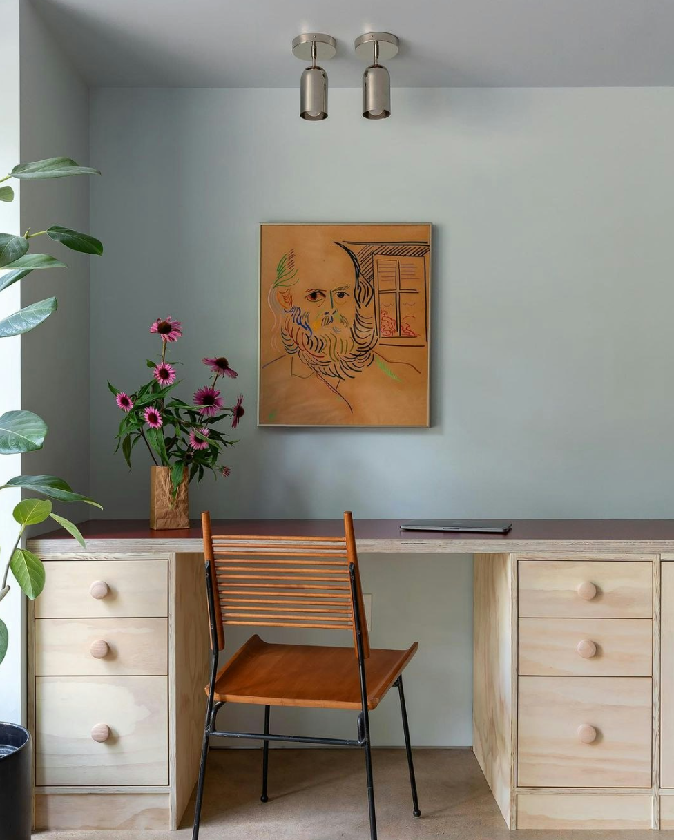
This is a soft, light gray with blue undertones. Super neutral and balanced.
A lovely and simple pale blue.
Backdrop Paint
On tour
How to Bring These Colors Into Your Home
Whether you’re tackling a full room makeover or just refreshing your decor, color can be introduced in countless ways. Here are some easy ideas:
Accent Walls: While we’re seeing a movement toward whole-room boldness, an accent wall is always a safe way to integrate color without overwhelming the space. Choose one bold color to ground a space and bring personality.
Textiles: Add pops of color with throw pillows, blankets, or rugs.
Artwork: Let bold, vibrant pieces set the tone for a room.
Furniture and Decor: Experiment with colorful chairs, lamps, or vases for subtle yet impactful changes.
The Psychology of Winter Colors
Winter (especially here in Denver) may strip the world of vibrant greens and warm sunlight, but it’s also an opportunity to embrace hues that nurture us. By thoughtfully layering colors that energize, calm, uplift, and restore, you can create a home that feels like a personal retreat—even in the darkest months.
Start with what resonates most. Is it the sunny cheer of yellow, the serene depth of teal, or the reflective calm of navy? Trust your instincts, and let your home become a canvas for color therapy that supports your emotional well-being.


